JetsFansUnited

DonMaynard

5th Year Team Option
Jet Fanatics
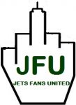
personally, i'm not a fan of the fist. that symbol has been used in some political contexts, including both black power (like the black panther party) and for white supremists

http://en.wikipedia.org/wiki/Raised_fist

i would have suggested having a jet inside the logo, but if you are keeping the city skyline, that could make it look like the jet is about to fly into a skyscraper.

the oval shape (or whatever geometric shape HYATT wants to call it) looks much better

I was going to say pretty much the same thing. The raised fist evokes some memories of darker times and racial unrest.. to me , it seems more a symbol of defiance , than unity.
 

isired

Pro Bowl Alternate
Jet Fanatics
Well, it doesn't say solidarity to me. It says, "you come too close to me mofo and I'll blow your effin' brains out."

As for the second point I have bolded, I am reminded of an interview I saw with a Jet player a few days after September 11, 2001. He said something like,

"The guy on the other side of the line of scrimmage from me is not my enemy. He is my opponent. The guys who knocked those buildings down? They are my enemy."

The fist says to me everyone who is not a Jet fan is my enemy.
the raised fist has been used in unions worldwide as a symbol of solidarity and unity since there were unions.

And also, as you point out, for other things. I would say that, to you and anyone who regularly comes here, intent matters.

The fact that there are positive examples of a clenched fist does not ameliorate the fact that the symbol is deeply offensive to some. A good example along these lines is the Confederate battle flag. There are many for whom this is a symbol of heroism and inspiration. But there are others who are deeply offended by it. Which group would it make more sense to accommodate?
I admit, I find it odd that the fist is deeply offensive without consideration for context or intent. Isn't that tantamount to finding kids in sheets on Halloween deeply offensive? I think you have to consider the context and the intent.

I do think the fist could be softened to seem less threatening; it could be misconstrued as a martial arts or MMA-related. And I think from a marketing perspective, there's got to be some football ID in there - the image will stand alone often, and if it doesn't say "New York Jets Football" on first glance (I know it can't literally say that, so it has to say it visually), then it's not doing its job.

what about a fist bump would that be better?


View attachment 569
Bro!

I think a photo of JN raising the #1 is copyrighted. ..I don't know for how long.

Not sure a drawing of a generic raised hand with a raised index finger is quite the same thing

Something to check out...any in house attorneys posting here want a nice pro bono commission?
The rights to non-news use of an actual photo of the moment would be the property of the photographer, publication, estate, etc. A drawing of a raised hand with the index finger extended in a similar manner is fine. Nobody owns the rights to that moment. Just don't take the original and manipulate it digitally to look like a drawing, that could be considered use of the photo. If you have it drawn from a *slightly* different angle, you're bulletproof. And Jets fans will know what it is.

EDIT: There are 5 different angles on the first group of results, I think you could pull it off.
https://www.google.com/search?q=joe+namath+super+bowl+finger
 
U

ucrenegade

Guest
If you have it drawn from a *slightly* different angle, you're bulletproof. And Jets fans will know what it is.


I agree with this assement
 

Elias

The Invisible Man
Big Fish
Jet Fanatics
Jets Global
the raised fist has been used in unions worldwide as a symbol of solidarity and unity since there were unions.

And also, as you point out, for other things. I would say that, to you and anyone who regularly comes here, intent matters.

I admit, I find it odd that the fist is deeply offensive without consideration for context or intent. Isn't that tantamount to finding kids in sheets on Halloween deeply offensive? I think you have to consider the context and the intent.

I do think the fist could be softened to seem less threatening; it could be misconstrued as a martial arts or MMA-related. And I think from a marketing perspective, there's got to be some football ID in there - the image will stand alone often, and if it doesn't say "New York Jets Football" on first glance (I know it can't literally say that, so it has to say it visually), then it's not doing its job.

Bro!

The rights to non-news use of an actual photo of the moment would be the property of the photographer, publication, estate, etc. A drawing of a raised hand with the index finger extended in a similar manner is fine. Nobody owns the rights to that moment. Just don't take the original and manipulate it digitally to look like a drawing, that could be considered use of the photo. If you have it drawn from a *slightly* different angle, you're bulletproof. And Jets fans will know what it is.

EDIT: There are 5 different angles on the first group of results, I think you could pull it off.
https://www.google.com/search?q=joe+namath+super+bowl+finger

Hey check your pm! Thanks for the clarification on the copyrights
 

HYATT™

Pro Bowl 1st Team
Jet Fanatics
HYATT™'s first impression was that of the Union solidarity fist, (long-time Carpenters Union member, among others), but that symbol was born out of a life and death, literally, struggle and it DOES symbolize a willingness to commit violence in fighting back to protect Union rights - INTENTIONALLY so.

The very next thought was of the 1968 Summer Olympics moment, again, a symbol of solidarity but one with implicit connotations of a willingness to commit mayhem if the rights of those displaying it are not respected.

The upraised fist clutching an AK-47 may not be exactly the same, but the similarity DOES raise an unconscious association with terrorism and nationalist struggles, globally, as it's been used by many rebel groups, over time.

As a person who isn't prone to knee-jerk reactions and always tries to consider all aspects of things, after a lengthy consideration of the fist image, HYATT™ does not find it to be a suitable one for this forum - especially considering events surrounding & prompting the forum's origination & the sort of trolling in general that occurs on football sites.
Also, consider what J-F-U looks like. (F-You) :smiley-violent001:

HYATT™ also understands the reluctance of the originator of the fist idea to consider sentiments standing against the fist idea to be AS valid as their own intent in using it.
Mothers always let their children grow up to be cowboys, even though they hate the danger inherent in the profession.

HYATT™ agrees design by committee is not always a sensible thing, but HYATT™ also does not see any immediate urgency in creating and finalizing the site logo.
Perhaps more time and consideration is still in order.
Not too much, but enough that people have a bit longer opportunity to try and come up with other ideas.
This WAS a pretty rushed job, for a community-approved undertaking.

An ellipse is a better idea than a circle, because it looks like both a football and the Jets logo.
Adding laces to the top of the ellipse is also an improvement on a simple ellipse.
There is a somewhat lesser merit to the idea of the cityscape appearing atop the ellipse instead of inside it, largely because it enables more detail to go INSIDE the ellipse.
The NYC skyline isn't a bad idea, especially as it's seen from the NEW JERSEY side of the river, but recognize that it does inhibit and limit the choice of what else goes into the ellipse, including the name of the forum.

Fonts that have slanted or irregular edges tend to be harder to read - especially at a distance.
Clarity and instant recognition would seem to be a more prudent governing criteria for a font selection, even if it tends to be somewhat generic-looking.

Overall, not saying HYATT™ could do any better, but surely the designer can.

LOL @ the bong logo.
At first I thought it was a bomb with 2 lit fuses, until a double-take revealed the cannabis leaves.
 

Elias

The Invisible Man
Big Fish
Jet Fanatics
Jets Global
Thanks Hyatt for your thoughts. We didn't Rush the logo we just unveiled it now but have been thinking of it for a while. It's like when a product goes through a focus group. Seemed like this one failed, prob be a bad idea if we go through w it if we were a big business but obviously this is just a hobby so depending on our discussions we'll see how it goes.

You didn't tell us about your thoughts on the namath guarantee finger instead of the fist.
 

Jet Fan RI

Pro Bowl 1st Team
Jet Fanatics
I admit, I find it odd that the fist is deeply offensive without consideration for context or intent. Isn't that tantamount to finding kids in sheets on Halloween deeply offensive? I think you have to consider the context and the intent.

Well I don't think I can put into words my reaction to that symbol. It was immediate, almost like blind rage. The moment I saw it my thoughts were along the lines of "if this place is using that as a symbol, I'm outta here." So I don't think the Halloween analogy is apt, but I really don't think I am able to explain it.

Still, if I feel that way, I suspect there may be others who feel that way too. Would it be wise to choose a symbol for the group that might instill visceral negative reactions in some viewers?
 

HYATT™

Pro Bowl 1st Team
Jet Fanatics
Those aren't fingers...it's simply the NYC skyline.

You guys have dirty minds.
Uh-huh, riiiiiiiight roger.
:roflmao:

Elias, not particularly enamored with the whole #1 finger to begin with.
Thought it was a stupid foam rubber prank when it started in Iowa in '71 and haven't changed my opinion on it since.
 

Elias

The Invisible Man
Big Fish
Jet Fanatics
Jets Global
I like the overall design, but have to agree with other posters that the raised fist could send the wrong message. I realize that it's been used as a symbol of union solidarity, but when I first saw it my thought was of the black panther movement.

Thnx for your input
 

BlindsideD'Brick

Franchise Tagged
Jet Fanatics
I just think of militancy, too. Regardless of your politics, it just seems to not represent what the board is about. I like a more "brotherhood" symbol like a hand shake or fist bump myself. The Jet symbol is good too, but like someone else noted, probably not a good idea set against the skyscraper background. Wouldn't be appropriate.
 

isired

Pro Bowl Alternate
Jet Fanatics
Uh-huh, riiiiiiiight roger.
:roflmao:

Elias, not particularly enamored with the whole #1 finger to begin with.
Thought it was a stupid foam rubber prank when it started in Iowa in '71 and haven't changed my opinion on it since.

I think he meant the iconic image of Bway Joe leaving the field after SBIII, finger aloft.
 
Top